Brand guidelines // V2
One firm. Three practices. One brand.
The logo, colour, type, voice and imagery of Mach Advisory™, with every file you need to use them well.
01 // Overview & positioning
Architect it. Build it. Launch it.
Mach Advisory™ is an AI-first engineering and go-to-market advisory firm. We architect your AI strategy, engineer the solution, and launch it to market on our own AI platform, with data-driven results you can measure.
Who we are
Rare combination. Real results.
Strategy firms hand you a plan. Dev shops write the code. Agencies run the launch. Every handoff costs you context, time and momentum. Mach carries your initiative from blueprint to production to market with one team and one point of accountability.
Three practices, one point of accountability
Each practice owns one accent colour, which carries through art, rules and numerals.
Consulting & Architecture
AI readiness, roadmaps, target-state architecture
Explore the practice →02 // EngineerEngineering & Development
Agentic-first builds, integration, platforms, pods
Explore the practice →03 // LaunchGTM Enablement & Launch
Technical GTM, positioning, enablement, launch
Explore the practice →How the brand behaves
Mach is a consulting firm, not a software company. The brand sells judgement, speed and accountability, so it shows ideas and structure, never product screenshots.
02 // Voice & tone
Direct. Technical. Confident.
Mach sounds like a senior operator who has shipped this before. Headlines state the point, then the payoff arrives in the light weight.
Write like this
Direct, technical, confident
- Outcome first, feature second.
- Short sentences and active verbs: architect, engineer, launch, ship.
- Specific over superlative: "readout within one week".
- Company voice: "Mach" and "we".
- Numerals, always: 3 practices, 45 minutes, 1 team.
- Headline as a statement, then the payoff in the light weight.
Never
The tells of generic copy
- Em dashes. Use a colon, a comma or a full stop.
- Copy built around one person's biography.
- "Cutting-edge", "world-class", "synergy", "leverage".
- Exclamation marks and emoji.
- Unsourced statistics and invented client names.
- Describing a product. We are a consulting firm: we sell expertise and outcomes.
Same message, two ways
We leverage cutting-edge synergies to deliver world-class AI solutions!
We architect it, build it and launch it on our own AI platform, with data-driven results you can measure.
Six lines in the Mach voice
Taken from the site. Use them as a pattern, not a script.
Architect. Engineer. Launch.
Three verbs, one rhythm. The home page headline.
The team that designs it builds it, and the team that builds it launches it.
Explains the idea in one sentence.
45 minutes to a discovery call. 1 week to a readout. 3 practices, 1 team.
Numerals, no adjectives.
Strategy firms hand you a plan. Dev shops write the code. Agencies run the launch.
Short parallel sentences, then the turn.
Ready to move at Mach speed?
A direct question, a plain button: "Schedule a free consultation".
Rare combination. Real results. One team from blueprint to production to market.
Statement, payoff, one line of substance.
03 // Logo
Three circles. One centre.
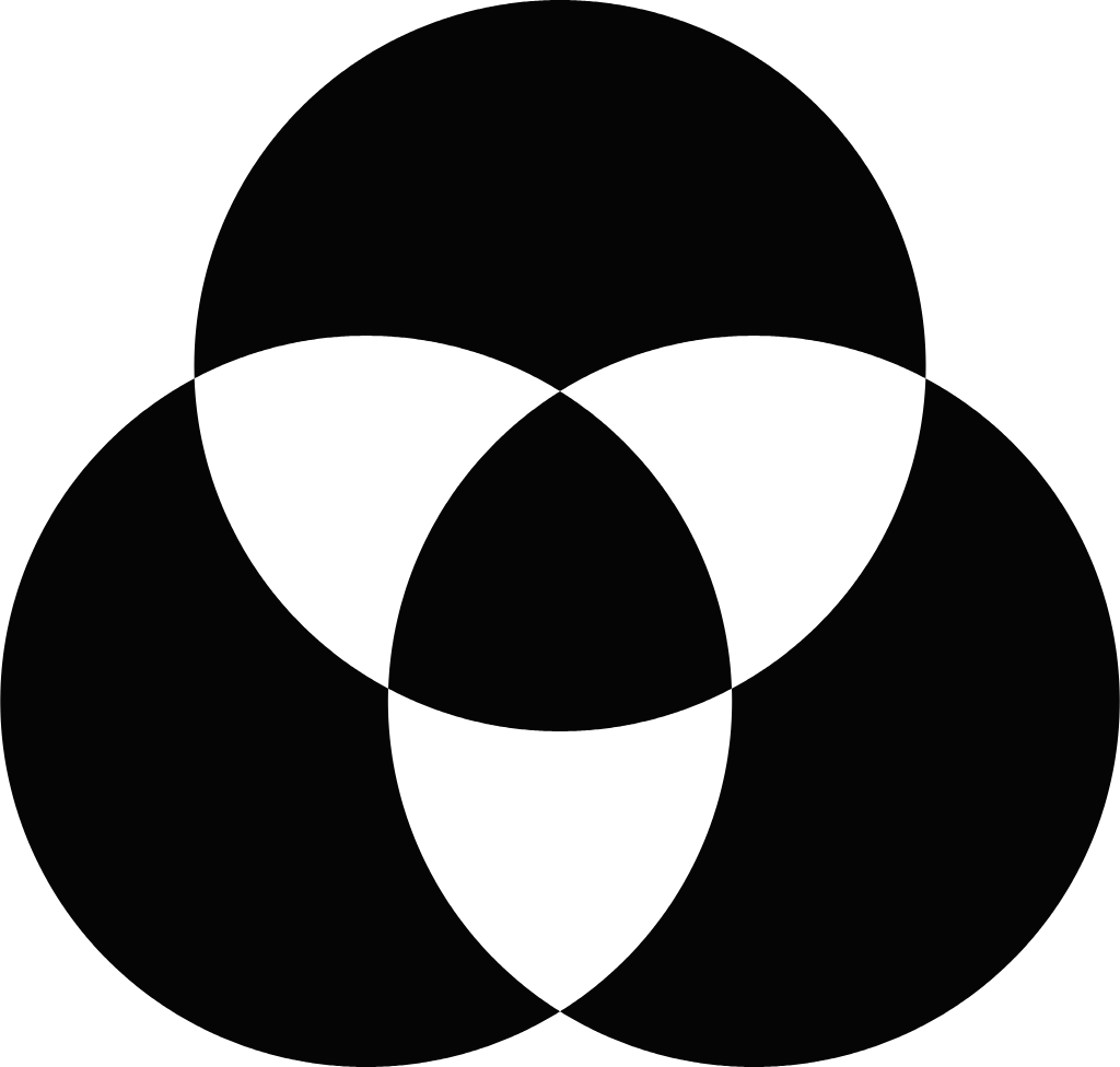
The symbol is the idea: three practices converging on one team. It is always paired with a plain, confident wordmark.
Primary lockups
Colour on dark is the default. Use the colour-on-light files on white and light-grey backgrounds. White and black versions are for single-colour use.
On dark


On light



Symbol construction
Drawn from a single radius so the symbol can be rebuilt exactly in any tool.
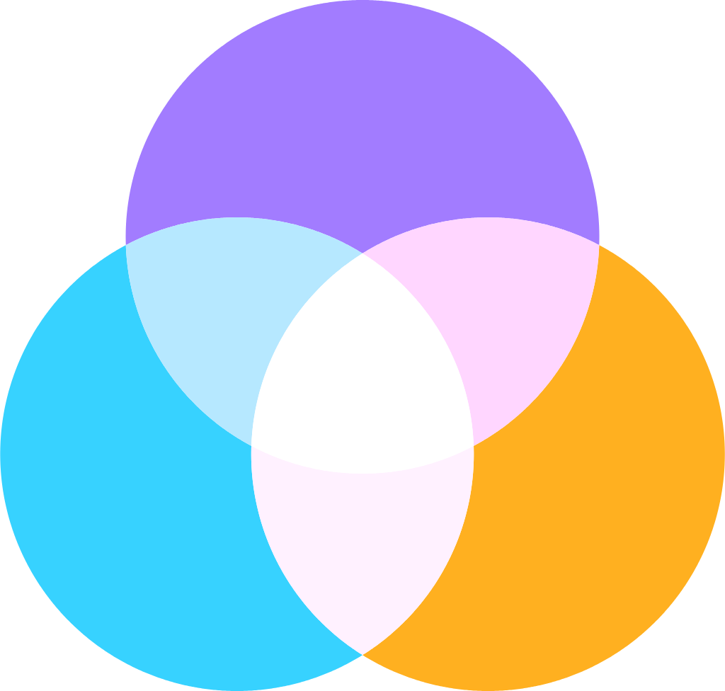
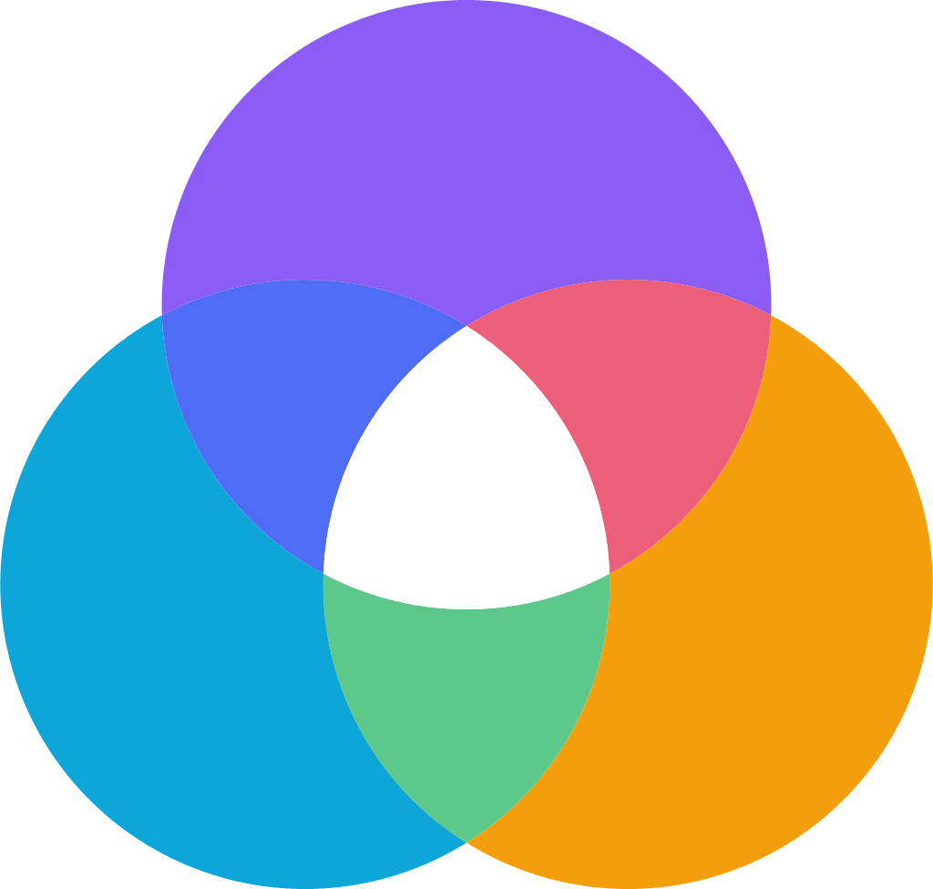
- 1Equal circlesThree circles of one radius R: Architect (violet), Engineer (cyan), Launch (amber).
- 2One triangleCentres sit on an equilateral triangle, 1.06 R apart, so every pair overlaps by the same amount.
- 3A white centreWhere all three meet the overlap is white: three practices, one team, no handoffs.
- 4Flat colourOverlaps are flat paths, not blend modes, so the symbol prints and scales identically everywhere.
Mach.
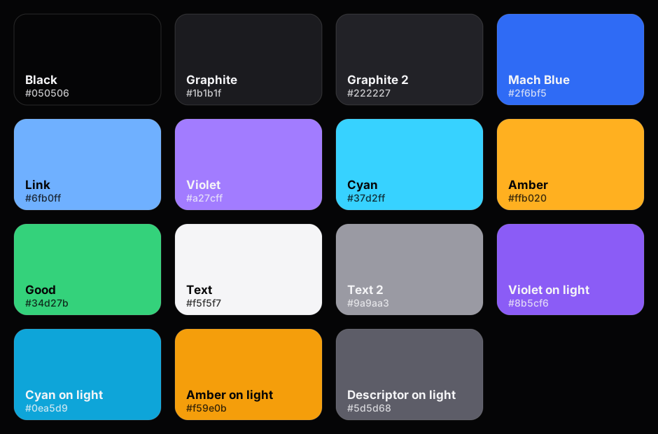
“Mach” in Inter ExtraBold (800), tracking −0.035em, with a round Mach Blue (#2f6bf5) period. “ADVISORY” in Inter Medium (500), tracking +0.30em, grey (#9a9aa3 on dark, #5d5d68 on light). On the site nav both are live text in the system font.
Clear space
Clear space = the height of the M
Keep a margin equal to the cap height of the M in the wordmark (x) free of text, edges and other graphics, on all four sides. In the horizontal lockup that is 0.61 of the logo height. Use the same x for the stacked and symbol-only logos.
Minimum size
Digital minimums are measured on screen at 1x. Always prefer the larger lockup when there is room.


Misuse
Eight things we never do. Each is shown live, using the real logo file.
Don’t stretch or squashScale proportionally, always.
Don’t recolourOnly the supplied colour, white or black files.
Don’t rotateThe logo is always level.
Don’t add effectsNo shadows, glows, bevels or outlines.
Don’t use a busy backgroundUse a calm field, or the white or black logo.

Don’t go low contrastBlack logo on Graphite disappears.
Don’t retype the wordmarkNever set it in another font or case.
Consulting that shipsDon’t crowd itKeep the clear space free of text and edges.
04 // Colour
A black canvas. Three accent lights.
Colour is used sparingly: graphite surfaces, white and grey text, one blue for action, and one accent hue per practice. Click any swatch to copy.
Practice colours
Never mix two practice colours in one component. Mach Blue stays reserved for action.
Consulting & Architecture
AI readiness, roadmaps, target-state architecture
--violet #A27CFF rgb(162, 124, 255)
Engineering & Development
Agentic-first builds, integration, platforms, pods
--cyan #37D2FF rgb(55, 210, 255)
GTM Enablement & Launch
Technical GTM, positioning, enablement, launch
--amber #FFB020 rgb(255, 176, 32)
Gradients
Accessible pairings
Computed contrast for the pairings we use. Anything not listed needs checking before it ships.
| Sample | Pair | Ratio | WCAG | Use |
|---|---|---|---|---|
| Aa | Text on Black #F5F5F7 on #050506 | 18.71 : 1 | AAA | Headlines and body. |
| Aa | Text 2 on Black #9A9AA3 on #050506 | 7.30 : 1 | AAA | Supporting copy. |
| Aa | Text 2 on Graphite #9A9AA3 on #1B1B1F | 6.15 : 1 | AA | Captions inside cards. |
| Aa | Link on Black #6FB0FF on #050506 | 9.05 : 1 | AAA | Links at any size. |
| Aa | White on Blue #FFFFFF on #2F6BF5 | 4.62 : 1 | AA | Primary button label. |
| Aa | Violet on Black #A27CFF on #050506 | 6.66 : 1 | AA | Architect accents, any size. |
| Aa | Cyan on Black #37D2FF on #050506 | 11.47 : 1 | AAA | Engineer accents, any size. |
| Aa | Amber on Black #FFB020 on #050506 | 11.14 : 1 | AAA | Launch accents, any size. |
| Aa | Black on Amber #050506 on #FFB020 | 11.14 : 1 | AAA | Dark label on a Launch fill. |
| Aa | Black on Cyan #050506 on #37D2FF | 11.47 : 1 | AAA | Dark label on an Engineer fill. |
| Aa | Black on Violet #050506 on #A27CFF | 6.66 : 1 | AA | Dark label on an Architect fill. |
| Aa | Blue on Black #2F6BF5 on #050506 | 4.41 : 1 | AA large | Large text, rules and dots only. Use Link for small text. |
| Aa | Blue on White #2F6BF5 on #FFFFFF | 4.62 : 1 | AA | Wordmark period on light. |
| Aa | Text 2 on White #9A9AA3 on #FFFFFF | 2.79 : 1 | Fail | Avoid for small text on white. Use #5d5d68. |
Ratios are computed from the hex values with the WCAG 2.x relative-luminance formula. AA needs 4.5 : 1 for body text and 3 : 1 for large text (24px, or 19px bold).
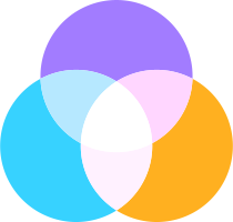
On light backgrounds
The symbol and descriptor shift slightly on white so they stay vivid and legible.
05 // Typography
One family. Two weights of voice.
Scale, spacing and weights below are read straight from the site stylesheet.
Rendered in Inter
abcdefghijklmnopqrstuvwxyz
0123456789 & . , : ; ? ( ) →
Typeface
SF Pro, with Inter as the cross-platform match
On Apple devices the site renders in SF Pro Display and Text. Everywhere else it falls back to Inter, then to the system font. Use Inter whenever you work outside the site: slides, documents, social artwork. It is open source (OFL) and included in the kit.
font-family: -apple-system, BlinkMacSystemFont, "SF Pro Display", "SF Pro Text", Inter, system-ui, "Segoe UI", Roboto, sans-serif;
Type scale
Live samples at the site’s real sizes. Sizes with clamp() scale smoothly between phone and desktop.
line-height 1.02 · tracking -0.04em
weight 600 · Text
h1
line-height 1.08 · tracking -0.03em
weight 600 · Text
h2
line-height 1.15 · tracking -0.02em
weight 600 · Text
h3
line-height 1.5 · tracking 0
weight 300 · Text 2
.lede
line-height 1.6 · tracking 0
weight 400 · Text
body
line-height 1 · tracking 0
weight 600 · White
.btn
line-height 1.55 · tracking 0
weight 400 · Text 2
.card p
line-height 1.6 · tracking 0.09em
weight 500 · Text 2
.eyebrow
Headlines are Semibold with tight tracking. The second half of a headline drops to Light and Text 2 grey. Body copy is never bolder than Regular. Always sentence case, never all caps except eyebrows.
06 // Imagery & art language
Cinematic, abstract, unhurried.
Every hero, hub and service page has its own generated artwork. These are the real, live files: slow, dark, and lit by a single practice colour.
Right-weighted subject
The subject sits right of centre. The left third stays calm so a headline can sit there.
One accent hue per practice
Violet for Architect, Cyan for Engineer, Amber for Launch. The other hues appear only as faint glow.
Slow motion
Loops run 7 to 140 seconds, ease in and out, and stop for people who prefer reduced motion.
Abstract and cinematic
Light, depth and structure on a near-black field. Ideas, not interfaces.
No screenshots
We sell expertise, not software. Never show app UI, dashboards or product shots.
No pixel art, no stock
The V1 pixel art is retired. No stock photography, no clip-art, no 3D mascots.
Composition
Architect // Service: the left third stays calm for a headline, the subject sits right of centre.
One hue per practice
Animated live. Violet is Architect, Cyan is Engineer, Amber is Launch.
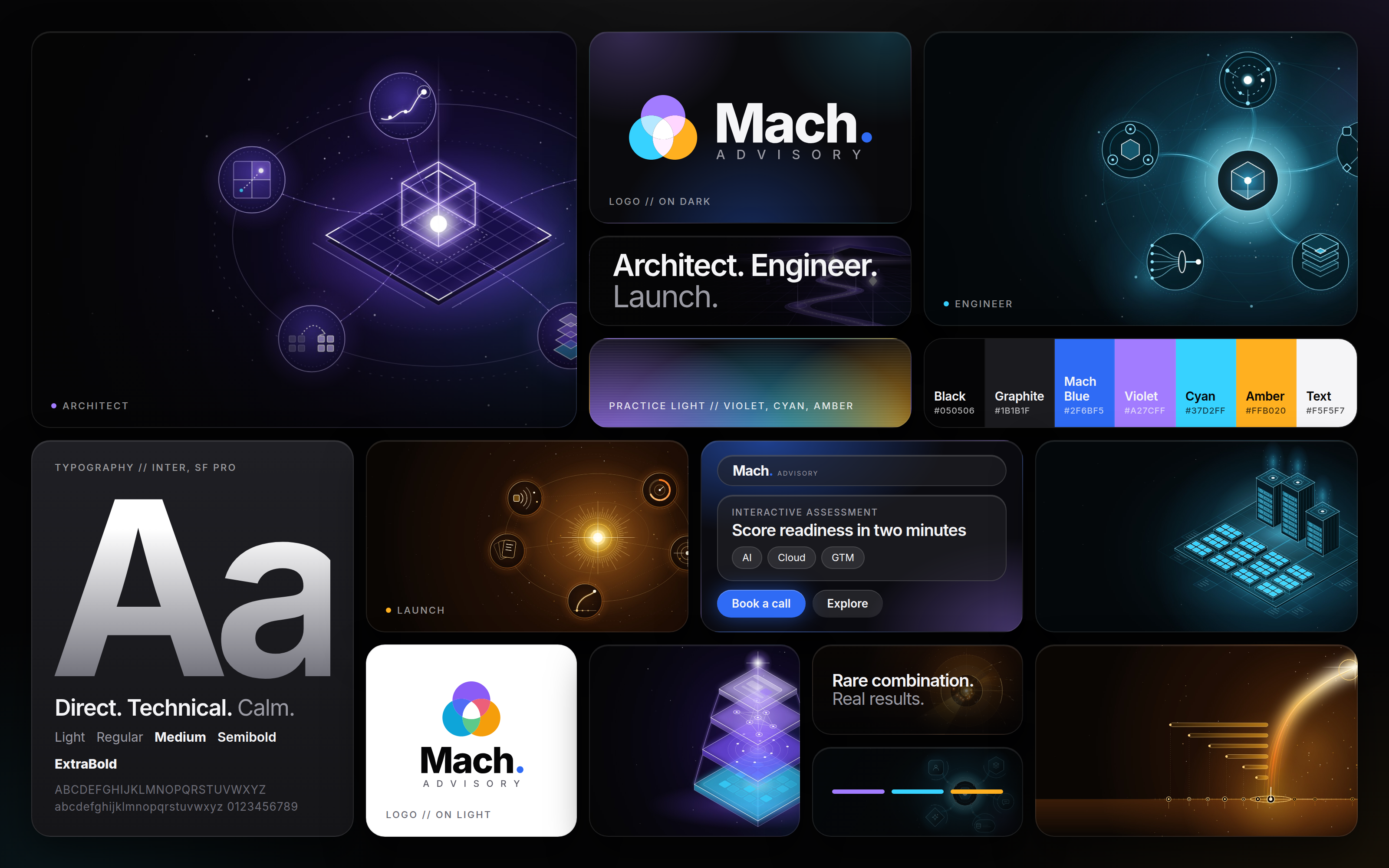
Mood board
The board we brief designers and partners with.
07 // UI components
Dark glass. Pill shapes.
The real components from the site stylesheet, rendered live.
Pill, 50px high (38px small), Semibold 16px. Primary is Mach Blue with a soft blue glow; ghost is a 10% white fill.
Full-radius pills. Tags use a 5% white fill and a 12% white stroke; status uses Good green.
AI engineering & go-to-market advisory
Eyebrow: 12px, Medium, +0.09em, uppercase, Text 2. The practice line carries the number, a 36px rule and the name.
panel
card
36px for hero tiles, 40px for the closing call to action.
Glass
Readout within one week
Where the gaps are and what to fix first.
rgba(34,34,38,.6), blur(40px) saturate(180%), 1px stroke at 12% white, 1px inner highlight at 15%. Only on top of imagery.
Engineering & Development
Agentic-first builds, integration, platforms, pods.
Graphite, 26px radius, 30px padding, 1px stroke. Hover lifts to Graphite 2.
A floating glass pill, 58px high, with the live wordmark: “Mach” in Bold 22px, a blue period, ADVISORY in 12px at +0.16em.
Art fills the tile, a left-to-right black fade protects the copy, headline sits on the calm left third. 36px radius.
08 // Motion
Slow in the background. Quick to respond.
Interface feedback is fast, ambient art is very slow. Durations and easings are taken from the site stylesheet.
Motion supports, never performs. Everything stops under prefers-reduced-motion, and nothing loops faster than 7 seconds.
10 // Iconography & favicon
The symbol, at every size.
Small sizes use the symbol alone on the dark canvas. Never put the wordmark in an icon.
Actual size
 16 px
 32 px
 48 px
 64 pxMach Advisory™
 App icon
 Avatar
 Apple touch 180
The icon set
- favicon.svgScalable favicon for modern browsers
- favicon.ico16, 32 and 48px for legacy browsers
- apple-touch-icon.png180px, full-bleed square (iOS rounds it)
- android-chrome-192.pngAndroid home screen, 192px
- android-chrome-512.pngAndroid splash, 512px
- android-chrome-maskable-512.pngMaskable, symbol inside the safe circle
- safari-pinned-tab.svgSingle-colour mask for Safari pinned tabs
- app-icon.svgRounded app icon, vector master


11 // Downloads
Everything you need, in one place.
Use the files as supplied. If you need a version that is not here, ask us rather than recreating it.
Logos (SVG and PNG), icons, fonts, social files, colour files, mood board and the PDF, with a README.
Download .zip Read offlineBrand guidelines PDFThis guide as a 15-page, 16:9 document for decks, partners and print.
Download PDF InspirationMood boardFrames, colour, type, voice and glass UI on one 3200 x 2000 board.
Download PNG| Logo | Colour on dark | Colour on light | White | Black |
|---|---|---|---|---|
| Horizontal Default. Use wherever there is room. | SVG · PNG | SVG · PNG | SVG · PNG | SVG · PNG |
| Stacked Square and portrait spaces. | SVG · PNG | SVG · PNG | SVG · PNG | SVG · PNG |
| Wordmark + Advisory Text-only, matches the site nav. | SVG · PNG | SVG · PNG | SVG · PNG | SVG · PNG |
| Wordmark Compact text-only mark. | SVG · PNG | SVG · PNG | SVG · PNG | SVG · PNG |
| Symbol Avatars, favicons, small sizes. | SVG · PNG | SVG · PNG | SVG · PNG | SVG · PNG |























- Inter Regularwoff2
- Inter Mediumwoff2
- Inter Semiboldwoff2
- Inter Boldwoff2
- Inter ExtraBoldwoff2
- Inter licence (OFL)txt
- mach-colors.cssCSS variables
- mach-colors.jsonJSON
- mach-colors.aseAdobe swatches
- mach-colors.gplGIMP palette
- mach-palette.svgSwatch sheet
Mach Advisory is an AI-first engineering and go-to-market advisory firm. We architect it, build it and launch it on our own AI platform.
Mach Advisory is an AI-first engineering and go-to-market advisory firm. We architect your AI strategy, engineer the solution, and launch it to market on our own AI platform, with data-driven results you can measure. Three practices, Consulting & Architecture, Engineering & Development, and GTM Enablement & Launch, work as one team with no handoffs.
Questions about the brand?
Planning a co-branded page, a partner deck or a launch? Send us what you have and we will review it with you.
09 // Social & avatars
One system, every channel.
Banners, avatars, posts and story templates for LinkedIn, X, Facebook, Instagram, YouTube and Reddit. All use the symbol, one practice colour at a time, and the same calm-left composition.
LinkedIn 2 files
X 2 files
Facebook 2 files
Instagram 8 files
YouTube 2 files
Reddit 2 files